Macbook review
In a shameless attempt to attract traffic I’m gonna do a short review of my new Macbook ;). I had been playing with the thought of buying a new laptop for a while now, and was almost certain it would be the Dell XPS 1330, since Apple didn’t really offer anything for me at that time (the Macbook Pros were too big and expensive, the Macbook Air was even more expensive and the Macbooks were made of plastic, which I really didn’t like). Right on time Apple released their new model, which is what I’m typing on right now ;)
I’m really not a good reviewer since I don’t pay attention to some stuff most people think of as important. Also I was out of the loop for quite a while, so this new laptop brought not only a ridiculous leap in speed but also the new version of Mac OS (and an Intel x86 to run a lot of stuff not available on PPC).
Performance
See, this is nice, I can say “compared to my G4 1.33Ghz I had been using before…”. Let’s just say that now I can view youtube-videos without 100% CPU usage, I can run two OSs in parallel, where the previous machine hardly ran one, I can compile for hours without the laptop breaking a sweat. The only thing you could count as a benchmark was that I fired up Urbanterror for about 10 seconds and it ran flawless on the native 1280×800 resolution.
Having a really really fast hard-drive is noticeable as well, deleting files doesn’t take forever and I’m able to really max out the 100mbit link. The DVD-drive looks good, the sound when waking up the laptop from sleep is much more quiet, as is the whole drive when watching a DVD.
Looks and feel
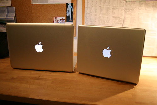
 Although I would have preferred another 12″ model from Apple, this kind of 13″ is still ok. The footprint is not that much bigger than my old Powerbook, and the Macbook is thinner (<1cm thinner), and about 200g lighter than the Powerbook.
The nice thing is that when closed, the new Macbook looks exactly like the bigger brother of the Powerbook. A few details have been improved. The screen closes like a magnet, snapping into place (like the previous Macbook), the sleep light is small and coupled to the ambient light sensor (good for sleeping next to it), and the edges are rounded below and above the Macbook, making it easy to grab it from a desk.
The Unibody looks nice and feels strong enough (I usually carry my laptop with one hand grabbing the spot right of the trackpad when it is open). The edges may feel a little sharp, but that depends on how fat your arms are and if you type a lot ;).
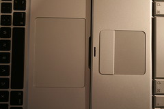
The Trackpad is just huge, bigger than my old trackpad and it’s mouse-button combined. The fact that it’s missing the actual button is absolutely no problem, you can click the whole pad or adopt the habit of just tapping the trackpad (two-finger-tap is a right-click, awesome).
At first I disliked the look of the keyboard, with its black color and the gaps between the keys, but after a few hours I didn’t notice any difference, and the touch and sound of the keyboard is nice and quiet (expect the f-ing spacebar).
The screen, yeah, you heard a lot about that. Let me tell you I was one the people who always began to curse when encountering one these glossy things in real-life. But there’s always some trade-off. And it does look nice. And so far I never had problems reading the screen, and I never got distracted by my own tired face staring back at me. The display is so ridiculously bright that I work below the maximum most of the time. The ambient light-sensor can adjust the display, which is another nice little feature and saves some minutes of battery in a dark environment.
Operating system and integration
One of the reasons I bought Apple again (after really hating it for a while in between) was that I realized that many of the small things you take for granted would be missing or way more complicated on other systems with less thought-through approaches of combining hardware and software. My holiday in the US showed that in certain situations you just want a laptop which is available when you open it, which starts everything necessary when you connect your camera and you just have to click download and which makes it really easy to pick a wlan when you’re leaning against a wall in some hotel trying to find a spot with reception. At the same time I still have a shell and all my little text-ui programs.
But enough of explaining my reasons. Mac OS 10.5 (Leopard) is a nice improvement over the previous version. Most of the stuff still works the same, the Terminal has been improved a little bit (with tabs for example, but still lacking 256 colors). The Finder still sucks donkey balls, and that is one department of the company Steve should have lined up and shot (when viewing your homedir the folders like “Music” and “Pictures” are now of the same color instead of the little colored images they used before). Good thing I don’t need it anyway. Instead of “Slideshow” there is Quickview, which seems to be the better choice for viewing large quantities of pictures and doesn’t discard your sort order. The Preview was improved in a few spots as well, as was Safari, though it’s still missing del.icio.us integration and a native way to do keyword-searches. Spaces is a native way to do virtual desktop, but I’m not using it so far.
Having a speedy machine now I decided to install Quicksilver, which takes the pain out of many things and makes up for missing functionality of other programs. I use it to launch apps and to browse my del.icio.us bookmarks for example.
Conclusion
Sorry for the messy review above, but I warned you before. The conclusion is that the Macbook is worth it’s price (I bought the 2Ghz, 2GB, 160GB version by the way), especially if your laptop is a little bit older. Whether you can live with the glossy screen is up to you, the best thing is to try one out for an afternoon, but it certainly isn’t a deal-breaker as many people suggested. I’m not missing anything about this laptop, not a FireWire-port, or a PC-Card slot or any other port. From a design-point of view it’s probably the most beautiful laptop I’ve seen so far, even more so when it’s closed. Here is a tip how to avoid being disappointed by the new hardware you just bought: Use your old stuff for about 4 years.


 Since I’ve been developing some stuff for a private intranet (read: web-interface for managing stuff), which runs in their internal network I’ve found myself SSHing into the router/firewall and then into the host I’m developing on. This itself being bad enough, it was even more annoying when you wanted to copy File X from Host A to Host B, where you always had to go through Host C.